

In today’s digital landscape, users access websites from a myriad of devices—smartphones, tablets, laptops, and desktops. Ensuring your website delivers a seamless experience across all these platforms isn’t just a luxury; it’s a necessity.
At EVpro Marketing, we emphasize the importance of responsive design to meet the diverse needs of your audience.
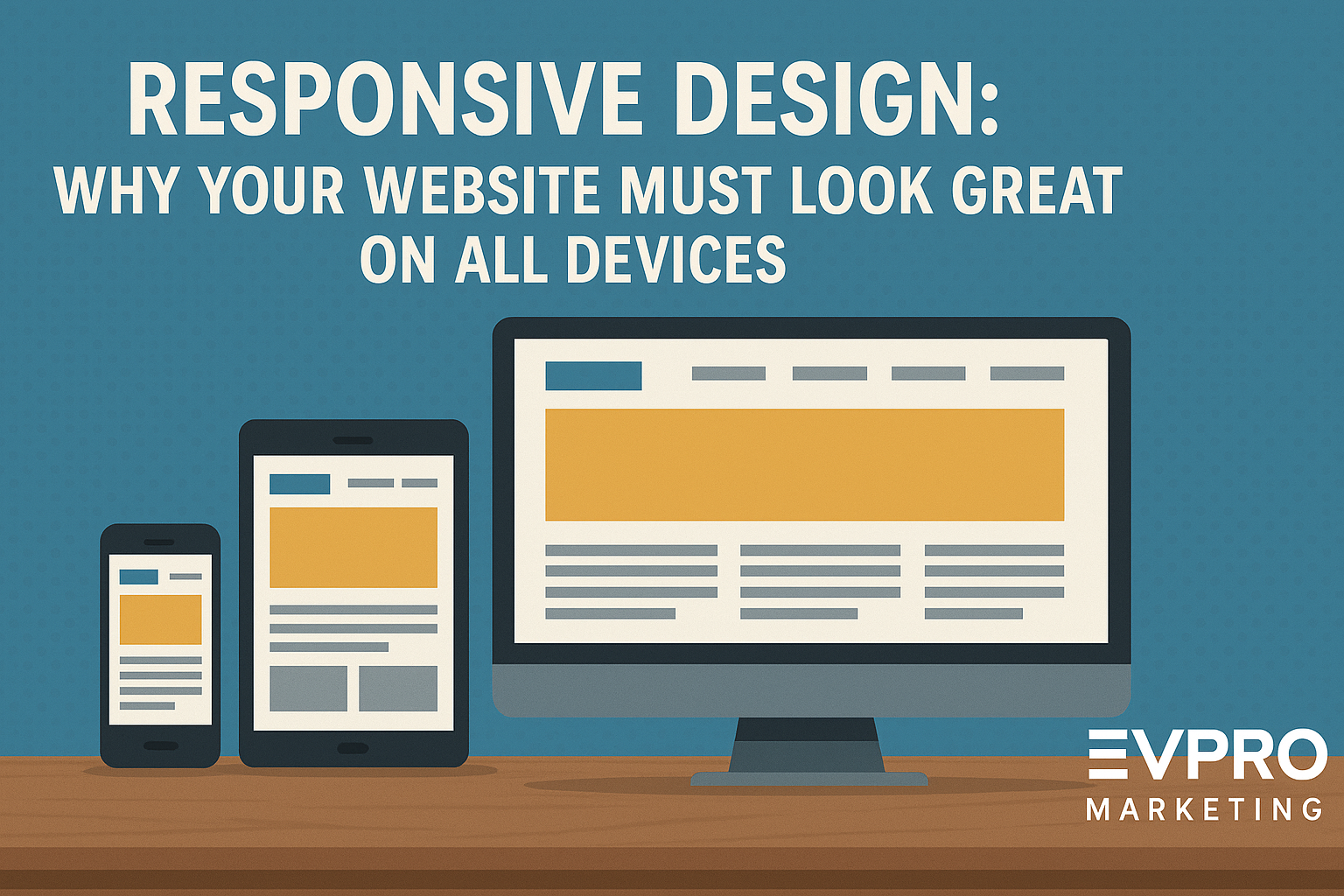
What Is Responsive Web Design?
Responsive web design is an approach where a website’s layout and content adapt fluidly to the screen size and orientation of the device being used. This ensures optimal viewing and interaction experiences, eliminating the need for excessive scrolling, resizing, or panning. Techniques like flexible grids, scalable images, and CSS media queries are employed to achieve this adaptability.
Why Responsive Design Matters
1. Enhanced User Experience
A responsive website provides a consistent and intuitive experience, regardless of the device. Users can easily navigate, read content, and engage with your site without frustration, leading to increased satisfaction and prolonged visits.
2. Improved SEO Performance
Search engines, notably Google, prioritize mobile-friendly websites in their rankings. A responsive design ensures your site meets these criteria, enhancing visibility and driving more organic traffic.
3. Increased Conversion Rates
When users have a positive experience on your site, they’re more likely to take desired actions—be it making a purchase, filling out a form, or subscribing to a newsletter. Responsive design reduces barriers to conversion by providing a smooth journey across all devices.
4. Cost and Time Efficiency
Maintaining separate websites for desktop and mobile users can be resource-intensive. Responsive design consolidates your efforts, allowing you to manage a single site that caters to all users, saving time and reducing maintenance costs.
Implementing Responsive Design: Best Practices
- Mobile-First Approach: Design for the smallest screen first, then scale up.
- Flexible Grids and Layouts: Use relative units like percentages instead of fixed pixels.
- Optimized Images: Ensure images scale appropriately and load efficiently on all devices.
- Media Queries: Employ CSS media queries to apply different styles based on device characteristics.
EVpro Marketing’s Commitment
At EVpro Marketing, we specialize in crafting responsive websites that not only look stunning but also perform exceptionally across all devices. Our team ensures that your website adapts seamlessly, providing users with an optimal experience that drives engagement and conversions.
Ready to Elevate Your Online Presence?
Ensure your website meets the demands of today’s diverse digital audience. Contact EVpro Marketing today to discuss how we can transform your site with responsive design.